
Nebeolisa Samson
Basic Portfolio with React

While it is not an absolute necessity for developers, particularly front-end developers, to have a portfolio website, the absence of one may potentially result in missed opportunities. A well-crafted portfolio provides recruiters with a valuable means of assessing your abilities and skill level, thus enhancing your prospects in the competitive job market.
In the contemporary job market, the process of job hunting has become increasingly challenging. It is essential to avoid self-exclusion from potential opportunities before even being considered. A portfolio website need not be an award-winning or revenue-generating project. It can be as straightforward as a one-page website, adequately showcasing the skills and expertise you can bring to a prospective employer.
In this article I'll show you how to create a simple portfolio website using React.js and Tailwind-Css. demo
sections
Tools needed for this course
To successfully navigate the entire process of developing this portfolio website, from the initial setup to the deployment phase, the following prerequisites are essential:
- I recommend using Visual Studio Code as your code editor, available for download at code.visualstudio.com
- Node.js must be installed on your computer, and you can obtain it from nodejs.org
- Git should be installed on your computer, and it can be acquired from git-scm.com
- Additionally, you will require a free Netlify account, which can be obtained at netlify.com
- Finally, it is important to have a free GitHub account, accessible at github.com
Prerequisite
You do not need to be an expert in any language or framework to be able to follow along with this course. All you need is just the basic understanding of the following
- Basic understanding of CSS
- Basic understanding of vanilla JavaScipt
- Import
- export
- If else
- Map
- Fundamental of React
- Components
- hooks
- React-Icon (Optional)
- Basic knowledge of React-Router
- Fundamental of Tailwind
- Basic knowledge of npm
- Netlify for hosting
How To get Started
The recommended way to start with this course is by cloning the github repository portfolio template and running npm install
or by creating a new react project using create-react-app as shown below.
Note : If you are cloned the above repo just move to The Index.html.
You can create a new folder directly on your device, drag and drop the folder into Vs Code, import the folder into Vs code or on your Vs code terminal type: mkdir react_portfolio and click enter. After that type cd react_portfolio
and click enter to move into the folder. Then run npx create-react-app portfolio, and next type cd portfolio and click enter to move into the project folder. lastly type code . and click enter to open
a new extension of VsCode
Now let's install all the needed tools. open up your terminal and make sure you are on the Portfolio folder
ie: ... ~/OneDrive/Desktop/Sample/Sample/Portfolio_Website/react_portfolio/portfolio (master)
then in your terminal copy and paste these lines of text starting with np
below and make sure to click enter after each paste:
    // Tailwind CSS Installation
    > npm install -D tailwindcss
    > npx tailwindcss init
    > npm install -D @tailwindcss/forms

    // React-Icon Installation
    > npm install react-icons --save

    // React-Router Installation
    > npm install react-router-dom
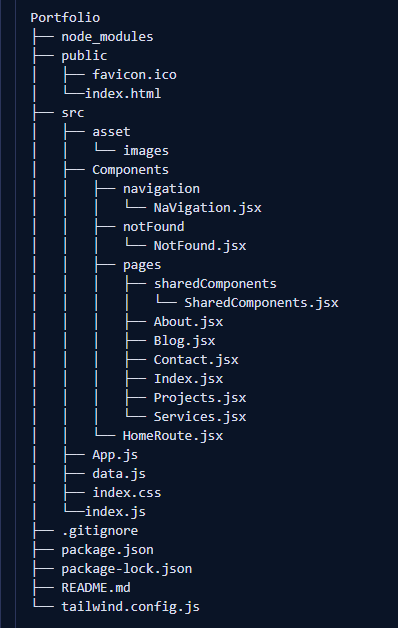
The Portfolio Structure
-
Cleaning up

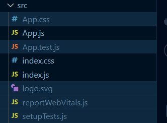
Let's start by deleting all the selected files in the images above from their various folders ie: open the
public folderselect and delete thelogo192.png
, thelogo512.png
, themanifest.json
and therobots.txt
. After that also open thesrc folderselect and delete theApp.css
, theApp.test.js
, thelogo.svg
, thereportWebVitals.js
, and thesetupTests.js
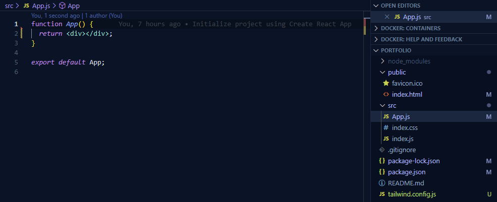
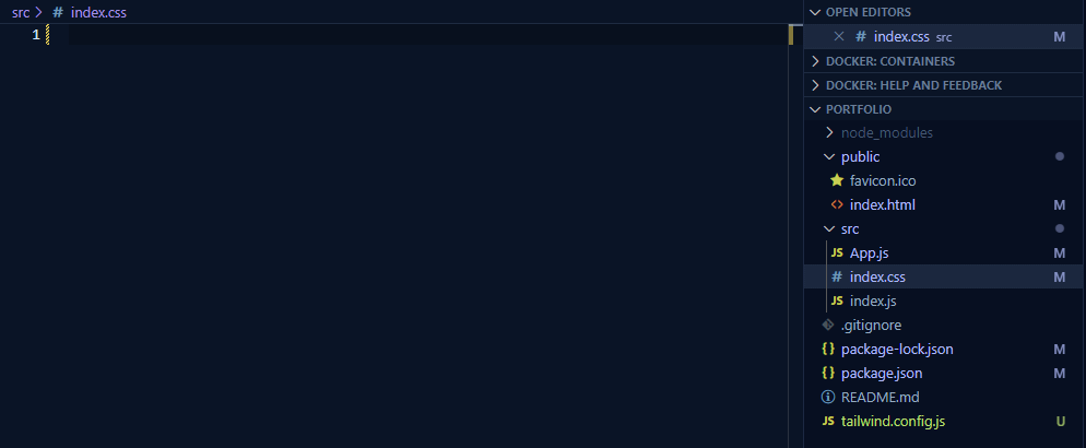
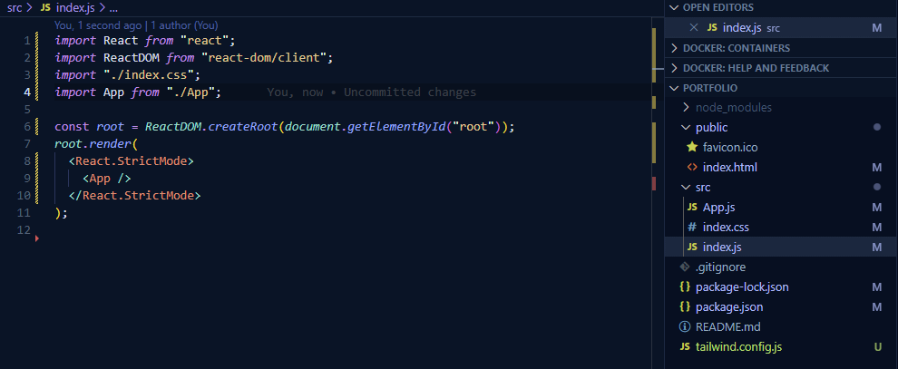
. These are files we will not be working on in this course.After that clean up the comments and things that are not needed from the
Index.html
,App.js
,index.css
, andindex.js
as in the images below:
-
New pages, component and needed material
Since we're using React for this course, it would be beneficial to use component chunks for easier updates and management. With that said, now inside the
src foldercreate two more folderassetandComponentsfolders and one file calleddata.js. Thedata.js
file will container most of the information that can easily be changed depending on the owner choice.Inside the
asset folder
create another folder calledImageswhich will contain all the image needed for the website. On the otherhand inside theComponents folder
create three more foldernavigation,notFound,pagesfolders and a component calledHomeRoute.jsx.On the
navigation
folder createNavigation.jsxcomponent and within thenotFound
folder create aNotFound.jsxcomponent. Last but not the least within thepages
folder create anAbout.jsx,Blog.jsx,Contact.jsx,Index.jsx,Projects.jsx,Services.jsxcomponents and a folder calledsharedComponentsfolder which contains theSharedComponents.jsxcomponent.Your Files should now look like this:
The Index.html
With the completion of the cleanup, folder and file creation, we are now prepared to proceed with the addition of necessary lines of code and the placement of essential links.
Henceforth, we shall commence our work within the index.html file. Please navigate to the public
folder and locate the index.html
file,
where we will insert metadata tags for keywords, description, and authorship. Additionally, you have the liberty to incorporate a font of your choosing or use mine, select a favicon that aligns with your
preferences. Lastly, modify the title to a name that suits your preference.
font:
https://fonts.googleapis.com/css2?family=Josefin+Sans:wght@100;200;400;500;600;700&family=Lora:ital@0;1&family=Varela&family=Varela+Round&display=swap
  <!DOCTYPE html>
  <html lang="en">
    <head>
      <meta charset="UTF-8">
      <meta http-equiv="X-UA-Compatible" content="IE=edge">
      <meta name="viewport" content="width=device-width, initial-scale=1">
      <meta name="theme-color" content="#000000">
      <meta name="keywords" content="React, Tailwind, portfolio sample">
      <meta name="description" content="Portfolio website sample">
      <meta name="author" content="Chiemezie Samson">
      <link rel="icon" type="image/x-icon" href="./favicon.ico">
      <link rel="stylesheet" href="your-Font">
      <title>Portfolio website sample</title>
    </head>

    <body>
      <noscript><a>You need to enable JavaScript to run this app.</a></noscript>
      <div id="root"></div>
    </body>
  </html>
The Tailwind CSS
For this project, we need to set up Tailwind CSS for React application. You can easily do this by following the instructions in the Tailwind documentation for reactjs project setup.
Let's commence by working on the tailwind.config.js file. Within this file, we will specify the locations where Tailwind should look for the files that require styling. Additionally, it's important to note that we won't be disabling 'Preflight' so as to retain some of the stylish
features provided by @tailwind base
.
Furthermore, we'll be creating "font families" by utilizing the font links we previously included in our HTML. Lastly, we will incorporate the Tailwind-form plugin that we installed at the beginning of this project.
  module.exports = {
    content: ["./src/**/*.{js,jsx,ts,tsx}", "./public/index.html"],
    corePlugins: {
      preflight: true,
    },
    theme: {
      extend: {
        fontFamily: {
          round: ["Varela Round", "sans-serif"],
          lora: ["Lora", "serif"],
          josefin: ["Josefin Sans", "sans-serif"],
        },
      },
    },
    round: [require("@tailwindcss/forms")],
  }
The Index.js
Given that we will be making use of React Router version 6.18.0 for this project, it is important to understand the fundamental concept of React Router and what role it will play in this project."
React Router enables "client side routing". Client-side routing enables your application to modify the URL when a link is clicked, all without needing to send another request to the server for a new document. In this way, your application can swiftly display a fresh user interface and employ fetch requests to retrieve data and refresh the page with updated information. Therefore, we will be using React Router for the navigation links.
Now, let's navigate into the src
folder and then to the index.js
file. All we need to do in this file is to import RouterProvider from react-router-dom and then use it within the
React.StrictMode.
import { RouterProvider } from "react-router-dom";
and change:
<App />
to:
<RouterProvider router={App}/>
The Index.css
As we are utilizing Tailwind CSS for styling, we shall configure the index.css
file in accordance with the guidelines provided in the Tailwind documentation. Additionally, we will include a few specific styles required for this project.
  @tailwind base;
  @tailwind components;
  @tailwind utilities;


  @layer base {
    html {
      @apply scroll-smooth overflow-x-hidden overscroll-contain m-0 p-0
    }

    *, *::before, *::after {
      @apply m-0 p-0 box-border no-underline
    }

    body {
      @apply m-0 p-0
    }

    img {
      @apply w-full h-full object-cover object-center cursor-pointer
    }

    [type='text'],
    [type='email'],
    textarea {
      @apply bg-transparent w-full border-slate-300 rounded-lg shadow-sm
        focus:outline-none focus:border-pink-400 focus:ring-0 mb-3
        caret-pink-500 text-lg text-slate-400 font-bold border
        border-solid outline-none ring-0 h-auto resize-none
    }

    textarea {
      @apply h-40
    }
  }
The App.js
The 'App.js' file serves as the main entry point for the routing. Here, we'll set up all the necessary routes for this project, beginning with the root route
, the index
and extending to handle any not-found page routes. You can learn
more about routing here. With that said, we will start by importing the createBrowserRouter from
react-router-dom
and we will also import all the component files we created in The Portfolio Structure. After importing the needed files we will the go ahead and create a route for the project.
Finally we will export the route we created.
  import { createBrowserRouter } from "react-router-dom";
  import HomeRoute from "./Components/HomeRoute";
  import Index from "./Components/pages/Index";
  import About from "./Components/pages/About";
  import Service from "./Components/pages/Service";
  import Projects from "./Components/pages/Projects";
  import Blog from "./Components/pages/Blog";
  import Contact from "./Components/pages/Contact";
  import NotFound from "./Components/notFound/NotFound";

  const App = createBrowserRouter([
    {
      path: "/",
      element: <HomeRoute />,
      errorElement: <NotFound />,
      children: [
        {
          index: true,
          element: <Index />,
        },
        {
          path: "about",
          element: <About />,
        },
        {
          path: "service",
          element: <Service />,
        },
        {
          path: "project",
          element: <Projects />,
        },
        {
          path: "blog",
          element: <Blog />,
        },
        {
          path: "contact",
          element: <Contact />,
        },
      ]
    }
  ]);

  export default App;
The Data.js
As previously mentioned, the data.js
file will serve as the repository for important portions of informations that can be conveniently customized to align with the developer preferences.
Within this file, we will organize arrays of data that contains the information required for the project. This approach enhances data management and facilitates seamless updates in areas that may not
align with the developer specific requirements.
So, here in the data.js
file we will have to import some social media icons from react-icons and few images for projects and blog. Finally we will create an array for navLinks,
socialIcons, button, Project_image, Blogs and contactObj.
As their names implies, the navlinks
array will contain the essential information required for routing the project's navigational elements.
The socialIcons
array will house the necessary details about the developer social media profiles. The button
array will store
the information used for selecting the developer projects. In a similar fashion, the Project_image
array will contain the datas needed to be
displayed as the developer completed projects. The Blogs
array will contain the information relevant to the blogs authored by the developer.
Lastly, the contactObj
array will hold the developer contact information.
    import {
    FaDribbble, FaFacebook, FaLinkedin,
    FaMailBulk, FaMapMarked, FaMobileAlt, FaTwitter } from "react-icons/fa";
    import project1 from "./asset/images/project1.jpg";
    import project2 from "./asset/images/project2.jpg";
    import project3 from "./asset/images/project3.jpg";
    import project4 from "./asset/images/project4.jpg";
    import project5 from "./asset/images/project5.jpg";
    import project6 from "./asset/images/project6.jpg";
    import Blog1 from "./asset/images/Blog1.jpg";
    import Blog2 from "./asset/images/Blog2.jpg";
    import Blog3 from "./asset/images/Blog3.jpg";

    export const navLinks = [
      {
        id: 0,
        name: "Home",
        number: "00",
        link: "/",
      },
      {
        id: 1,
        name: "About",
        number: "01",
        link: "about",
      },
      {
        id: 2,
        name: "Service",
        number: "02",
        link: "service",
      },
      {
        id: 3,
        name: "Project",
        number: "03",
        link: "project",
      },
      {
        id: 4,
        name: "Blog",
        number: "04",
        link: "blog",
      },
      {
        id: 5,
        name: "Contact",
        number: "05",
        link: "contact",
      },
    ];

    export const socialIcons = [
      {
        id: 0,
        icon: FaDribbble,
        link: "https://twitter.com/SamsonChiemezie",
      },
      {
        id: 1,
        icon: FaFacebook,
        link: "https://twitter.com/SamsonChiemezie",
      },
      {
        id: 2,
        icon: FaLinkedin,
        link: "https://twitter.com/SamsonChiemezie",
      },
      {
        id: 3,
        icon: FaTwitter,
        link: "https://twitter.com/SamsonChiemezie",
      },
    ];

    export const button = [
      {
        id: 0,
        name: "All",
      },
      {
        id: 1,
        name: "Seo",
      },
      {
        id: 2,
        name: "website",
      },
      {
        id: 3,
        name: "App",
      },
    ];

    export const Project_image = [
      {
        id: 0,
        name: "Project title",
        category: "website",
        seo: "seo",
        image: project1,
      },
      {
        id: 1,
        name: "Project title",
        category: "website",
        seo: "seo",
        image: project2,
      },
      {
        id: 2,
        name: "Project title",
        category: "App",
        image: project3,
      },
      {
        id: 3,
        name: "Project title",
        category: "App",
        image: project4,
      },
      {
        id: 4,
        name: "Project title",
        category: "website",
        image: project5,
      },
      {
        id: 5,
        name: "Project title",
        category: "website",
        image: project6,
      },
    ];

    export const Blogs = [
      {
        id: 0,
        author: "By Samson",
        title: "There are Many variation",
        text: `My blog content.....`,
        image: Blog1,
        date: `14 Nov 2023`,
      },
      {
        id: 1,
        author: "By Samson",
        title: "There are Many variation",
        text: `My blog content.....`,
        image: Blog2,
        date: `14 Nov 2023`,
      },
      {
        id: 2,
        author: "By Samson",
        title: "There are Many variation",
        text: `My blog content.....`,
        image: Blog3,
        date: `14 Nov 2023`,
      },
    ];

    export const contactObj = [
      {
        id: 0,
        icon: FaMobileAlt,
        title: "Call Us On",
        text: "+86-13291396526",
      },
      {
        id: 1,
        icon: FaMailBulk,
        title: "Email Us At",
        text: "samsonchiemezie368@gmail.com",
      },
      {
        id: 2,
        icon: FaMapMarked,
        title: "Visit Office",
        text: "No. 639 Longmei Avenue, Jiangning Campus, Nanjing",
      },
    ];
The HomeRoute.jsx
This component is responsible for rendering the home(root) of the website. If you refer to The App.js where we've done the routing,
you will observe that our primary route path: "/" defines HomeRoute
as its primary element. Additionally, various other components
that we've created are all included within the children: [....] array, effectively making HomeRoute
the host for all these nested components.
The first thing we do in this component is to starts with importing necessary modules and components. We will import React
, the useEffect
and useState
hooks from React
.
The Outlet
component will be imported from react-router-dom
. The Navigation.jsx
component we created inside the navigation folder will also be imported. Lastly, we will also
import useWindowSize
hook from @uidotdev/usehooks
and a background image for the root page.
The
You will find more interesting Hooks at @useHooks.
useWindowSize
hook is a useful for retrieving and tracking the dimensions of the browser window within a React component. It attaches an event listener to the resize
event, ensuring that the size is updated dynamically whenever the window is resized.
The hook returns the size
object, enabling components to access and utilize the window dimensions for various purposes, such as responsive layout adjustments, conditional rendering, or calculations based on the available space.
Note: Remember to first npm install @uidotdev/usehooks before importing. We will be using the useWindowSize
in closing the navigation bar if the screen width changes.
    import React, { useEffect, useState } from "react";
    import { Outlet } from "react-router-dom";
    import Navigation from "./navigation/Navigation";
    import { useWindowSize } from "@uidotdev/usehooks";
    import BackgroudImage from "./../asset/images/background.jpg";

    const HomeRoute = () => {
      const [showNavLinks, setShowNavLinks] = useState(false)
      const size = useWindowSize();

      // Handle opening and closing of navigation bar in small-screen devices
      const HandleShowNavLinks = () => {
        setShowNavLinks((state)=> !state)
      }

      // Handle closing of navigation bar in small-screen devices,
      //  when other part of the page is clicked
      const handleCloseSideBar = () => {
        setShowNavLinks(() => false)
      }

      // Handle closing of navigation bar if the screen width changes
      useEffect (() => {
        if(size.width >  640) {
          handleCloseSideBar()
        }
      }, [size])

      return (
        <div className="w-full relative overflow-clip font-round">

          {/* background Image */}
          <div className="fixed -z-20 inset-0 h-screen">
            <div className="relative isolate after:absolute after:z-10 after:inset-0 after:bg-black/50
              after:content-['']">
              <img loading="lazy" src={BackgroudImage} alt="BackgroudImage" className="h-screen"/>
            </div>
          </div>

          {/* Navigation Links */}
          <header className="w-full fixed top-0 z-50">
            <Navigation
              showNavLinks={showNavLinks}
              HandleShowNavLinks={HandleShowNavLinks}
              handleCloseSideBar={handleCloseSideBar}
            />
          </header>

          {/* other pages */}
          <main className="text-white text-center fixed bottom-0 inset-x-0 bg-pink-400">
            <Outlet />
          </main>

          <footer className="text-white text-center fixed bottom-0 inset-x-0 bg-pink-400">
            <small> Copyright 2023 © Nebe.Samson </small>
          </footer>
        </div>
      )
    }

    export default HomeRoute
The Navigation.jsx
In the Navigation.jsx
, we import Link and NavLink form react-router-dom
,
the navLinks array form the data.js
file, few icons for opening and closing the small-screen navigation bar and finally a logo image of choice.
We will also be making use of the functions HandleShowNavLinks, showNavLinks, and handleCloseSideBar
we create above on The HomeRoute.jsx.
  import React from "react";
  import Logo from "./../../asset/images/logo.jpg";
  import { FaBars, FaTimes } from "react-icons/fa";
  import { Link, NavLink } from "react-router-dom";
  import { navLinks } from "../../data";

  const Navigation = ({HandleShowNavLinks, showNavLinks, handleCloseSideBar}) => {
    return (
      <nav className="relative sm:py-5 max-h-24">

        {/* Website Logo */}
        <Link to={"/"} className="block max-h-16 max-w-16 rounded-full overflow-clip mx-4 mt-5 sm:mt-0"
          onClick={handleCloseSideBar}>
          <img loading="lazy" src={Logo} alt="webSiteLogo" className="h-16 w-16 rounded-full"/>
        </Link>

        <ul className={`bg-zinc-50/10 list-none supports-[backdrop-filter]:backdrop-blur py-2
          ${showNavLinks ?  "translate-x-0 visible opacity-100" : "translate-x-full invisible opacity-0"}
          sm:translate-x-0 sm:visible sm:opacity-100 sm:grid sm:grid-flow-col items-center sm:px-6
          transition-all duration-300 ease-out sm:max-h-20 absolute right-0 sm:top-8 top-0`}>

          {navLinks.map((link) => {

            return (
              <li key={link.id} className="mx-3 font-round md:mx-2 lg:mx-3 my-5 mr-20 sm:mr-0 sm:my-0"
                onClick={handleCloseSideBar}>

                <NavLink to={link.link} className={({ isActive, isPending }) => isActive ?
                  "text-pink-300" : isPending ? "text-purple-300 font-bold" :
                  "text-white font-bold hover:text-pink-400"}>
                  <span className="mx-3 sm:hidden md:inline md:mx-2 lg:mx-3">
                    {link.number}
                  </span>
                  {link.name}
                </NavLink>
              </li>
            )
          })}
        </ul>

        <button className="text-white sm:hidden text-2xl mt-5 cursor-pointer
          absolute top-0 right-2 bg-pink-300 hover:text-pink-300 p-0.5 shadow-sm shadow-black"
          onClick={HandleShowNavLinks}>
          {showNavLinks ? <FaTimes className="gird items-center"/> : <FaBars className="gird items-center"/>}
        </button>
      </nav>
    )
  }

  export default Navigation
The NotFound.jsx
The NotFound
component serves as a user interface component specifically designed for situations where a user accesses a URL that is not defined within
our established routing structure. Its purpose is to provide a clear and user-friendly representation of the unavailability of the requested resource,
enhancing the overall user experience by guiding them through instances of navigating to non-existent or undefined routes.
We will not be doing much on this componet, we just have to tell the user that the Page they are Looking For does Not Exit! and we add a quick link back to home page.
  import React from "react";
  import { Link } from "react-router-dom";

  const NotFound = () => {
    return (
      <div className="grid items-center h-screen w-full text-center">
        <div className="text-[199%] font-josefin font-semibold">
          <p>Sorry The Page You are Looking For does Not Exit!</p>
          <Link to={"/"} className="text-4xl text-pink-400 hover:text-pink-300 cursor-pointer
            transition-colors duration-200 ease-linear">
            Home
          </Link>
        </div>
      </div>
    )
  }

  export default NotFound
The SharedComponent.jsx
The SharedComponent.jsx
is designed to contain modules of components, each representing small, reusable units of functionality.
These component are intended for use within multiple primary components, promoting code reusability and maintaining a modular architecture
across the website. This approach helps in the management of shared UI elements and enhances the maintainability of the codebase by consolidating
common functionalities within a centralized SharedComponent module.
So here on the SharedComponent
folder, inside the SharedComponent.jsx we will create three modules of components PageHead, SocialMediaIcons and Button that we will use in other primary components.
  import { socialIcons } from "react-router-dom";

  export const PageHead = ({page}) => {
    return (
      <>
        <h2 className="font-black text-3xl pt-6 font-lora tracking-wide">
          <span className="font-medium">My</span> {page}
        </h2>

        <p className="text-lg my-0 py-2">
          Am a front-end Developer who loves building user-friendly
          website and web app and currently living in Nanjing China.
        </p>
      </>
    )
  }

  export const SocialMediaIcons = () => {
    return (
      <ul className="list-none m-0 p-0">
        {socialIcons.map((icon) => {
          return (
              <li key={icon.id} className="inline-block mx-2">
                <a href={icon.link} target="_blank" rel="noreferrer"
                  className="inline-block px-2 py-2 rounded-full bg-white group border border-solid
                    hover:bg-pink-400 active:bg-pink-700 transition-colors duration-200 ease-linear">
                  <icon.icon className="text-lg text-stone-700 grid items-center group-hover:text-white
                    transition-colors duration-200 ease-linear"/>
                </a>
              </li>
            )
          })}
        </ul>
      )
    }

    export const Button = ({text}) => {
      return (
        <button className="rounded-md py-3 px-5 bg-pink-400 border-0 border-solid border-pink-400 text-white
          mb-10 hover:bg-pink-300 active:bg-pink-700 transition-colors duration-200 ease-linear
          shadow-md shadow-white/50">
          {text}
        </button>
      )
    }
The About.jsx
The About component keeps it simple – it's just the spot where we present the developer information, throw in a cool image, and spice things up by importing those social media icons from our SharedComponent.jsx. Easy peasy, right?
  import React from "react";
  import AboutImage from "./../../asset/images/about.jpg";
  import { SocialMediaIcons } from "./sharedComponents/SharedComponent";

  const About = () => {
    return (
      <div className="md:grid md:items-center md:h-screen">
        <div className="md:grid md:grid-cols-2 md:gap-x-6 md:mx-4">
          <img loading="lazy" src={AboutImage} alt="aboutImage" className="object-fill"/>
          <div className="my-8 md:mt-3 mx-4 md:mx-0">

            <h2 className="font-medium text-2xl text-white mb-5 font-lora tracking-wide">
              About <span className="font-medium">Me</span>
            </h2>

            <h5 className="font-black text-3xl mb-1.5 text-white font-lora tracking-wide">
              HELLO! <span className="font-medium">I'm Samson Nebeolisa</span>
            </h5>

            <div className="px-1 max-w-xl mb-7 text-lg">

              <p className="mt-2.5 text-white">
                Lorem ipsum dolor sit amet,..... your information....
              </p>
              <p className="mt-2.5 text-white">
                Lorem ipsum dolor sit amet,..... your information....
              </p>
              <p className="mt-2.5 text-white">
                Lorem ipsum dolor sit amet,..... your information....
              </p>
            </div>

            <SocialMediaIcons />
          </div>
        </div>
      </div>
    )
  }

  export default About
The Service.jsx
We'll use the Service.jsx
component to inform users about the array of services at our disposal. This component serves as the go-to source for conveying the number of offerings we bring to the table.
We kick things off by importing an icon from react-icons/fa
. Additionally, we bring in the Button
and PageHead
components we created in the SharedComponent.jsx.
The next move involves creating an array to showcase the different services we can offer. Following a structured approach, we organize this array as a collection of objects, mirroring the format previously employed in the
Data.js file. This method allows for a systematic representation of service details, facilitating both clarity and maintainability. But for this course, since we're not rolling out any fancy services,
I'll keep it real and go with an empty arrays.
  import React from "react";
  import { FaRegChartBar } from "react-icons/fa";
  import { Button, PageHead } from "./sharedComponents/SharedComponent";

  const Service = () => {
    return (
      <div className="mx-4 md:grid md:items-center">
        <div className="text-center pt-16 text-white">

          <PageHead page={"Services"}/>

          <ul className="grid md:grid-cols-2 lg:grid-cols-3 gap-2.5 py-10">
            {[...Array].map((_, index) => {
              return (
                <li key={index} className="border border-solid border-white rounded-md shadow-lg
                  shadow-white/30">
                  <FaRegChartBar className="inline-block text-4xl text-pink-400 my-4"/>

                  <h2 className="my-0 pb-3 text-2xl font-lora tracking-wide relative after:absolute
                    after:top-full after:max-w-[150px] after:border-b-4 after:border-solid
                    after:inset-x-0 after:border-pink-400 after:content-[''] after:mx-auto">
                    Graphic Design
                  </h2>

                  <p className="mx-4 px-1.5 my-6">
                    Lorem ipsum dolor sit amet, consectetur adipiscing elit, sed do
                    eiusmod tempor incididunt ut labore et dolore magna aliqua.
                  </p>
                </li>
              )
            })}
          </ul>

          <h2 className="my-0 pb-3 text-lg">
            I Am Available for Freelance
          </h2>

          <Button page={"hire me"}/>
        </div>
      </div>
    )
  }

  export default Service
The Projects.jsx
The project.jsx
component acts as the container for the high-quality projects crafted by the developer.
It serves as the primary gateway to showcase the breadth and excellence of the developer work.
Okay, in this component, we're getting down to business. We'll use React's useState to handle which project gets selected when buttons are clicked,
and the useEffect hook will help us in updating the state with our projects from the project array we created in the data.js
when the page loads.
Plus, we're importing Project_image
, button
component from data.js
and PageHead
from SharedComponent.jsx
.
    import React, { useEffect, useState } from "react";
    import { Project_image, button } from "../../data";
    import { PageHead } from "./sharedComponents/SharedComponent";

    const Projects = () => {
      const [projects, setProjects] = useState(false)

      let handleBtn = (e) => {
        const Text = e.target.textContent

        if ( Text === "All") {
          return setProjects(() => Project_image);
        } else if ( Text === "Seo") {
          const SeoProjects = Project_image.filter((project) => project.seo)
          return setProjects(() => SeoProjects);
        } else {
          const category = Project_image.filter((project) => project.category === Text)
          return setProjects(() => category);
        }
      };

      useEffect(() => {
        setProjects(() => Project_image);
      }, [])

      return (
        <div className="mx-4">
          <div className="pt-16 mb-12 text-center text-white">

            <PageHead page={"Work"}/>

            <ul className="grid grid-flow-col max-w-xs mx-auto gap-x-2 text-center mt-5">
              {button.map((section) => {
                return (
                  <li key={section.id} className="bg-pink-400 hover:bg-pink-300 rounded-md
                    shadow shadow-white/50 cursor-pointer transition-colors duration-200 ease-linear"
                    onClick={(e) => handleBtn(e)}>
                    {section.name}
                  </li>
                );
              })}
            </ul>

            <ul className="grid lg:grid-cols-3 md:grid-cols-2 gap-4 mt-8">
              {projects.map((project) => {
                return (
                  <li key={project.id} className="relative z-0 isolate group overflow-clip rounded-md">
                    <img loading="lazy" src={project.image} alt="Project"
                      className="h-72 rounded-md object-fill"/>
                    <div className="absolute text-center inset-x-0  -top-16 invisible opacity-0
                      grid items-center after:absolute after:content-[''] after:inset-0
                      after:bg-black/40 group-hover:top-0 group-hover:bottom-0 transition-all
                      duration-200 ease-linear group-hover:opacity-100 group-hover:visible">

                      <span className="absolute z-10 inset-0 grid items-center">
                        <span className="font-medium">
                          category
                          <div className="text-2xl font-semibold mt-1">
                            {project.name}
                          </div>
                        </span>
                      </span>
                    </div>
                  </li>
                );
              })}
            </ul>
          </div>
        </div>
      )
    }

    export default Projects
The Blog.jsx
Alright, the blog.jsx
component takes charge of displaying the developer articles, whether they're for educational insights or project updates.
The special move here? We're just importing and using that handy blogs data array previously set up in The Data.js.
This simply will allows us to seamlessly integrate and showcase the developer written content within this component.
  import React from "react";
  import { Blogs } from "../../data";
  import { PageHead } from "./sharedComponents/SharedComponent";

  const Blog = () => {

    return (
      <div className="mx-4">
        <div className="text-center text-white pt-16 mb-12">

          <PageHead page={"Blog"}/>

          <ul className="grid gap-x-4 gap-y-8 md:grid-cols-2 lg:grid-cols-3 mt-8">
            {Blogs.map((blog) => {

              return (
                <li key={blog.id} className="text-left">

                  <div className="max-h-72 rounded overflow-clip shadow shadow-white/50 mb-7">
                    <img loading="lazy" src={blog.image} alt="blogImage" className="h-screen max-h-72
                      object-fill"/>
                  </div>

                  <h3 className="text-lg font-lora tracking-wide">{blog.title}</h3>

                  <small className="text-sm font-josefin mb-5 inline-block">
                    <time dateTime="2022-07-14">{blog.date}</time>
                    <span className="text-pink-300 ml-3 inline-block">{blog.author}</span>
                  </small>

                  <p>{blog.text}</p>

                  <button className="bg-pink-400 hover:bg-pink-300 rounded-md shadow shadow-white/50
                    cursor-pointer transition-colors duration-200 ease-linear mt-5 px-2">
                    Read More...
                  </button>
                </li>
              );
            })}
          </ul>
        </div>
      </div>
    )
  }

  export default Blog
The Contact.jsx
Here we start by importing the contactObj
array we created in The Data.js, Also we go ahead to import Button.
PageHead and SocialMediaIcons modules from SharedComponent.jsx
component. We're wrapping it all up with a cool
contact form right in this component.
  import React from "react";
  import { contactObj } from "../../data";
  import { Button, PageHead, SocialMediaIcons } from "./sharedComponents/SharedComponent";

  const Contact = () => {

    return (
      <div className="px-4 max-w-5xl mx-auto">
        <div className="text-center text-white pt-16">

          <PageHead page={"Contact"}/>

          <ul className="grid gap-x-2 gap-y-4 sm:grid-cols-2 md:grid-cols-3 mt-8 mb-12">
            {contactObj.map((data) => {

              return (
                <li key={data.id}>
                  <data.icon className="inline-block text-4xl text-pink-400 hover:text-pink-300
                    cursor-pointer transition-colors duration-200 ease-linear"/>
                  <h3 className="my-2 font-lora tracking-wide text-2xl">{data.title}</h3>
                  <p className="inline-block">{data.text}</p>
                </li>
              );
            })}
          </ul>

          <form className="px-2" id="form">

            <span className="grid sm:grid-cols-2 gap-x-2">
              <input type="text" placeholder="Your Name"/>
              <input type="email" placeholder="Your Email"/>
            </span>

            <input type="text" placeholder="Your Subject"/>
            <textarea placeholder="Your Message"/>

            <div className="text-right uppercase">
              <Button text={"Send Message"}/>
            </div>
          </form>

          <div className="my-8">
            <SocialMediaIcons />
          </div>
        </div>
      </div>
    )
  }

  export default Contact
The Git and GitHub
Before diving into Git and GitHub, let's ensure our application is up and running smoothly. Open your VSCode terminal and navigate to the project folder ie: ... ~/OneDrive/Desktop/Sample/Sample/Portfolio_Website/react_portfolio/portfolio (master)
Once there, fire up the engine by running npm start. This step ensures everything's in shipshape before we move on to the version control stage.
Alright, let's start with Git. If you're not already familiar with Git, I highly recommend you do — it's a must-have skill for developers. I'll walk you through a handful of key Git commands that'll help us set things up just right for our project. Enough to get everything where it should be, no more, no less!
git init: This is the very first command you'll need to use when starting a new project. It initializes a new Git repository in your current directory.
git add <𝗳𝗶𝗹𝗲𝗻𝗮𝗺𝗲>: After you've made some changes to your files, you'll want to stage them for a commit. This command adds a specific file to the stage.
git add . or git add -A: Instead of adding files one by one, you can add all your changed files to the stage with one command.
git 𝗰𝗼𝗺𝗺𝗶𝘁 -𝗺 "𝗖𝗼𝗺𝗺𝗶𝘁 𝗺𝗲𝘀𝘀𝗮𝗴𝗲" : Now that your changes are staged, you can commit them with a descriptive message.
git push origin <𝗯𝗿𝗮𝗻𝗰𝗵𝗻𝗮𝗺𝗲>: This command sends your commits to the remote repository(GitHub).
With That all said, let's Git up our project by runing the following commands in the terminal:
    // Add all changes to the stage
    > git add .

    // Commiting the changes
    > git commit -m "My Portfolio first commit message"
Now to GitHub, You can learn how to create a repository here GitHub Docs or watch video here youtube github repo.
After creating a repository you can then run the following commands in you VsCode terminal.
    // push an existing repository from the command line
    > git remote add origin https://YourRepository-URL

    // Because we are pushing for the first time and also want to push everything
    > git push --all
The Netlify
Once the project finds its way to GitHub, the next stop is Netlify. There, we'll select the 'Choose Site from Git' button. From the options available, we'll select GitHub for our continuous deployment process. Now, this is where the magic happens! We'll link our Netlify account to the GitHub repository where we've freshly pushed our code. This connection allows Netlify to automatically fetch updates from the linked GitHub repository, ensuring seamless and continuous deployment of our project whenever changes are made. After that, our project will be automatically deployed to the web!
Summary
Congratulations on reaching this milestone! With your portfolio project live on the web, you've created a powerful tool to showcase your projects and skills to potential employers. This live portfolio serves as a professional gateway, providing a comprehensive glimpse into your expertise, projects, and capabilities. It's your digital identity—a platform where you highlight your achievements, share your expertise, and make a compelling impression on anyone interested in your work. Now, your projects and skills are just a URL away from making a lasting impact on those seeking your talent.
Keep in mind that this project is a canvas for your ongoing improvements. You have the freedom to update and refine it to match any standard or requirement you desire. The insights gained from this tutorial extend beyond this project; they're versatile and can be applied to a wide array of projects. The concepts, techniques, and practices you've picked up here form a solid foundation applicable across various development endeavors. So, don't hesitate to tailor and enhance this project and leverage the knowledge gained here in your future projects.
I create awesome websites you will love. Working with you from start till end to make sure your goals are met and you are happy with the outcome is my number one priority.